
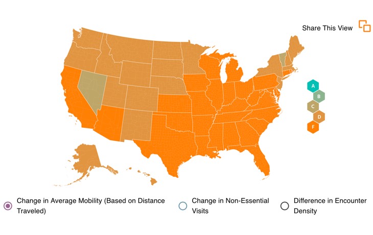
Three weeks ago, South Carolina was the only state in the country to earn an ‘F’ in social distancing. Now, Wisconsin gets an ‘F.’ Texas gets an ‘F.’ Nevada gets a ‘C.’ Florida gets an ‘F.’ Wyoming gets a ‘D+!’ And, averaged all together, an ‘F’ for the whole United States.
Since March, Unacast has been using Americans’ cell phone data to measure how well we’re social distancing. The Unacast algorithm has determined that overall, the United States gets an ‘F’ in social distancing. Unacast compares our mobility data from before the pandemic spread across the United States (prior to March 8, by Unacast’s calculation) with our current mobility to find out how well we’re social distancing.
This kind of data use has (rightfully) spooked lots of people. We at The Prepared even rang the alarm bell on this a month ago. But a lot has changed since then. Stay-at-home orders have expired in many states and people are going out much more than they were before. We’re staring down the barrel at another surge of infections and deaths.
Don’t get us wrong. Mobile data collection is a slippery slope, especially when it comes to personal location data. But the time has come for us to figure out how to leverage this data to keep each other safe as the pandemic marches on. So we’re here to break down the social distancing scoreboard and glean what we can.
Calculating social distance
We’ve learned since the start of this pandemic that social distancing properly is not as simple as keeping six feet apart and going about our daily lives as usual. To account for the many different ways in which we may or may not be social distancing, Unacast uses three different metrics:
- Distance traveled
- Visits to non-essential venues
- Encounters density
Unacast bases its model off the trajectory of Italy’s coronavirus cases. In Italy, under total lockdown, people reduced their usual distance traveled by 70 to 80 percent. So Unacast decided that to get an ‘A’ grade, Americans would have to reduce their travel by 70 percent. Basically, we were never going to hit that point. No state in the United States has ordered a full lockdown like Italy and most of Europe did.
Reducing trips to ‘non-essential’ venues — or not
Unacast’s metric helpfully distills possible destinations down to what’s essential and what’s not essential. The idea: our trips to essential destinations shouldn’t count against our social distancing efforts. Even in full lockdown, we’d need to make trips to pharmacies, grocery stores, and pet stores.
But since the pandemic began, every state has used a different approach to determining what’s essential and what isn’t. Our data leaders, however, are clear. The following are just some examples of non-essential destinations — places we don’t need to visit during a global pandemic:
- Restaurants (multiple kinds)
- Department and clothing stores
- Jewelers
- Consumer electronics stores
- Cinemas and theaters
- Office supply stores
- Spas and hair salons
- Gyms and fitness/recreation facilities
- Car dealerships
- Hotels
- Craft, toy, and hobby shops
More ‘non-essential’ locations are included in Unacast’s calculation, but the above gives us a sense of what it means when they say ‘non-essential.’ To calculate non-essential trips, the algorithm first subtracts all the essential destinations like grocery stores and pharmacies. Then, it uses an average of pre-COVID time (again, that’s before March 8) as a baseline. It then compares average mobility on any given pre-pandemic day of the week to movement since the pandemic began.
Right now, the United States has an ‘F’ in the Reduction in Non-Essential Visits category. Compared with how the whole country was moving in the pre-pandemic period, we’ve reduced our non-essential trips by less than 55% overall.
Mobility doesn’t necessarily predict virus spread
Data like what we’re talking about here does not predict the spread of COVID-19. Not exactly, at least. It measures how people are moving around right now and compares that to how they moved around in the pre-pandemic time. That’s important because social distancing is, for now, all we have.
We’ve had some good news lately about therapies that could be used to treat COVID-19. But a vaccine is in the distant future (if it’s coming at all), and other drugs aren’t available yet. So for now, all we can do is stay away from each other. It took the equivalent of an ‘A’ in social distancing for countries like Italy and China to get their COVID-19 numbers down to something manageable.
An ‘F’ from Unacast doesn’t necessarily mean we’re headed for gloom and doom. Nor does an ‘A’ mean we’re totally safe. Instead, the Unacast map is a measure of how much behavior has changed in each state or county. It gives us a sense of how people are responding to extended stay-at-home orders, how seriously they’re taking the virus’ threat, and how desperate they are to get out and ‘back to normal.’
And the data is particularly useful because it doesn’t compare rural communities to urban ones. Instead, it compares each place to its pre-pandemic self. It gives us rare insight into how our level of concern and preparedness matches up with that of our neighbors. It’s better than Twitter or Facebook for taking a pulse on how our neighbors say they feel about the pandemic. Instead, we get to measure how exactly they’re behaving.
It’s worth noting that Unacast, like Google and Facebook with their mobility reports, works hard to anonymize data. You won’t be able to tell if that one pesky neighbor across the street is social distancing. That’s for the best.
Using the social distance scoreboard to your advantage
Government officials and health authorities are using data like this to make choices about lockdown orders and to predict the virus’ spread. By looking at it for yourself, you can make sense of the changing rules for your family and friends.
The scoreboard is most useful the closer you zoom in. Pretend, for instance, that you live in Stanislaus County, California. You’re practicing social distancing. You haven’t left the house since March! Furthermore, all your friends are also taking social distancing seriously. So you’re probably thinking, can’t we be done with this lockdown business now?
But if you look at the social distancing scoreboard for your area, then the answer is probably a “no”. But your hypothetical confusion is perfectly understandable. Stanislaus County sits kitty corner to Mariposa County. If your diligently distancing friends live in the county next door, you’re probably right to think everyone is social distancing. Mariposa County has a ‘B-‘ grade. That’s one of the best grades in California, and Mariposa County has just 15 cases of COVID-19. But your own county, Stanislaus, has an ‘F‘ and a whopping 571 cases.
So, it’s entirely possible that your perspective is caught in a sort of social feedback loop. Your understanding of what’s going on outside is based on what your friends are saying they’re doing. But a glance at the dashboard will show you that your personal impression of what’s happening is not necessarily representative of the larger population—or even your own smaller community.
You are reporting the comment """ by on