

A new conspiracy theory has been making the rounds on the internet, including the front page of Reddit: that an “uncanny” fit between case numbers and a quadratic curve prove that 2019-nCoV case numbers are being fabricated from whole cloth by the Chinese government, with the acquiescence of the WHO.
In fact, the fit is not uncanny at all — a good fit is quite expected for this kind of data, and if the Chinese government were trying to make a fake curve, they wouldn’t use a quadratic. So this particular theory is just not worth taking seriously.
A brand new reddit user makes a suspiciously viral post
On Wednesday, a brand-new Reddit account called Antimonic posted a graph to the subreddit r/dataisbeautiful entitled “Quadratic Coronavirus Epidemic Growth Model seems like the best fit,” which has since racked up thousands of upvotes.
The post shows a quadratic curve fitted to the total cumulative case counts from the first 15 days of WHO Situation Reports, with an eye-catching R-squared value of .9995. Calling the data “propaganda” derived from a “quadratic model,” Antimonic accused the Chinese government of fabricating its data from whole cloth and predicted case and fatality numbers for the next week. The post has been blowing up since then.
Not a smoking gun
The first thing worth noting is that a quadratic is actually not the expected form of the case counts in an epidemic. There’s no epidemiological model which will project perfect conformity with a quadratic; real models largely follow exponential and logistic functions. So, fabricating case numbers to have them fit a perfect quadratic would both look highly suspicious, and also not simulate what anyone would expect.
But also, we took the same data (plus the extra days of data since Wednesday), and plotted it in the same manner, and the data are far from being a perfect quadratic. This is particularly clear when you consider the new daily case numbers, which for a quadratic would follow a perfect linear trend. They don’t.
The R-squared value of the fit for this data segment is only .88, and the divergences are large and clearly visible. The divergence from linearity becomes particularly pronounced in the days since Antimonic’s original post.
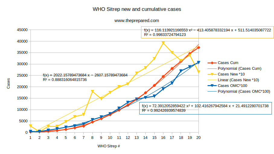
The quadratic, too, fits pretty well, but if you fit different quadratics to different subsets of the data they’re notably different. E.g., adding five more days of data to the original post, as we did, changes the “best fit” quadratic form coefficients from (123, 545, 905) to (116, 413, 511), and increases the divergence in R-squared (relative to a perfect fit) by over threefold.
If you look at the data from outside China, which is definitely not being faked by China, and fit a quadratic to cumulative case numbers, you’ll get a similarly eye-catching R-squared value of .992.
You also have to consider that the data aren’t just a single number each day, but the come subdivided by province and with supplemental data on critical cases, recovered cases, and deaths. If you look into that data in greater depth, as we have been doing in our statistical reports on the epidemic’s progress, and as the real experts have been doing in even greater depth, you’ll see all kinds of quirks which undermine the notion that the data are being faked with a neat model.
Finally, if the data were obviously fabricated the WHO wouldn’t be propounding them. You can quibble about their alleged delay in declaring a Public Health Emergency of International Concern, or disagree with their assessments of where the outbreak is now and where it’s headed next, but WHO are not stupid, nor are they in on a conspiracy to harm world health. Being knowledgeable and helping world health is kind of their whole thing.
Accounting for the fit is easy
So, why does messy real data fit a quadratic so well? It has to do with the nature of regressions and the way that an R-squared value is calculated.
Regressions pull from the universe of possible equations of a certain closed form, in this case quadratic. The quadratic closed form has three degrees of freedom, the coefficients of the constant, x, and x^2 terms, i.e. the y intercept, initial slope, and rate of increase in slope. Or, if you complete the square, the three degrees of freedom are the slope and the x and y coordinates of the vertex.
The regression, then, optimizes these parameters to fit the data as closely as possible, and it has a lot of “buttons” to push to make it fit pretty well, especially when there is not very much data to fit to. In fact, any data whatsoever with n points can be fit perfectly, with absolutely no error, using a polynomial of degree n-1.
In addition, modern statistical software can fit many types of models to the same data, and as our Redditor friend acknowledges, he tried many models before choosing the one with the most eye-catching R-squared value.
And the curve of a growing epidemic has some properties that inherently can make it kind of similar to a quadratic. It will be monotonically upward, and growing at an increasing rate. This means the regression calculation’s job is made easier by this crude similarity, and allows those eye-catching R-squared numbers. The R-squared value is calculated using the square of the differences between the model and reality, so it punishes a few large deviations more harshly than many small ones. That is, the joint information of the two curves being high is really just the observation that in general the curves look pretty similar, not a clinching judgment that the curve was faked using a model.
To illustrate this, let’s take a purely synthetic example. We generated two curves, one exponential and one quadratic, that both start at 100 on day 1 and end at 1440 or so on day 29. We then fit a quadratic to the exponential, and vice versa. These data really are synthetic and perfect, and we’re fitting the wrong model to each one. But in both cases, the fit is close and the R-squared value is .97 when we fit the exponential to the quadratic, and .994 when we fit the quadratic to the exponential.
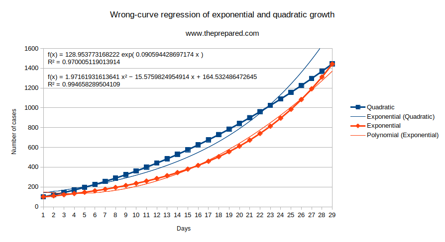
You can see that both fitted models start to fail at the end, as the exponential data grows faster than the quadratic model will allow, and vice versa.
OK, but why was our brand new Reddit friend’s R-squared value ten times closer to unity than our synthetic example? There are two reasons. First, he used only half as much data, making the model’s job easier. Second, unlike a platonic epidemic in a model, the 2019-nCoV case data is not a precise exponential, but has had a growth rate that slows over time, making it (by chance) an even better fit for a quadratic.
As more data piles up, we can expect to see the data diverge further from the quadratic.
We’re not saying the data is reliable, just that it’s not faked
All the experts agree that even if every single authority in the world were the most competent they could possibly be and were reporting everything they knew with complete candor, the data would still not be accurate, because many cases are latent with no symptoms, and even among symptomatic cases, most are not known to public health authorities.
However, of course, no public health authorities are the most competent they could possibly be, some are having disappointing failures, and it’s not clear if all actors worldwide are being completely honest (probably not!).
We’ve talked about the weaknesses in the data repeatedly, and we’ll keep doing so in the future. Those weaknesses are important. But being fabricated from whole cloth with a simple numeric model isn’t one of them.
You are reporting the comment """ by on