
This is a guest post from community member Rick Ryder.
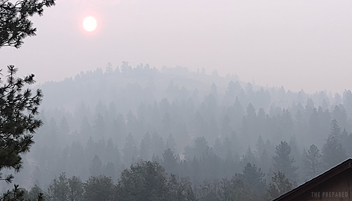
Like most places around the western US, every year my area seems to get worse with wildfires and the resulting smoke that blocks out the sky. I live off-grid in Eastern Washington, in an area firefighters refer to as a Wildland Urban Interface (WUI; pronounced woo-ee) where the forests start to meet developed areas.
In what I fear is a new normal, the constant particulates in the air from fires (and other sources of pollution, such as cars) make my family and I worried about our health. It’s been so bad that we choose to stay indoors some days, with windows and doors closed as the HEPA air filter runs.
Our local weather report often says “widespread haze with areas of smoke,” and it’s commonplace to see a “Hazardous Air Quality Alert” attached.
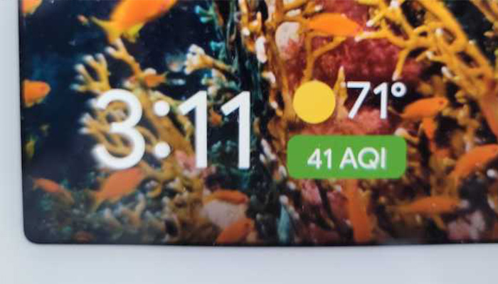
These problems are how many people became familiar with the Air Quality Index (AQI), the measure used to show how clean or poor the local air is. For example, a TP community member recently shared that the Google Nest Hub that sits on their kitchen counter has started showing the current AQI all of the time:
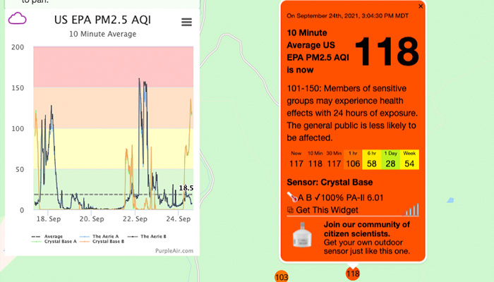
One of the most widely used measures of air quality is PM2.5 (Particulate Matter 2.5), which is the numerical value that corresponds to the density of fine particulates 2.5 microns or smaller (for reference, a human hair is about 70 microns wide). While larger particles will naturally fall, these smaller particles will float, potentially entering your lungs and bloodstream (your nose and throat won’t stop them), leading to problems like asthma and heart attack.
Any number above 150 is “unhealthy” and above 300 rates the air “hazardous.” Those numbers can change from one country to another, though. It used to be that numbers like 200-300 were really bad, but as the environment continues to get worse, places like China have “moved the goal posts” to stretch out the index benchmarks even further.
Densely populated urban areas are much more likely to have sensitive, calibrated, high-quality AQI monitors because that’s where most people live – a broad tax-base means a lower per-capita cost to deliver AQI information.
But rural or WUI areas often do not have government-supported air quality monitors.
Which meant in the past that those of us outside of cities had to guestimate based on AQI readings from too far away, or we just had to look at the hills in the distance and use our nose.
PurpleAir is a company that sells personal AQI monitors to “citizen scientists.” There’s an indoor model, but the two outdoor models run around $250-$280. The devices use lasers to measure the PM2.5 particulates in the air, giving you an AQI reading.
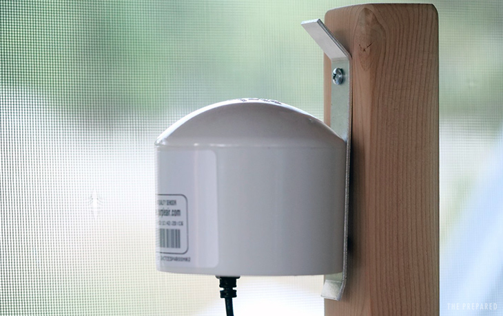
My family bought one and installed it on our property. It was easy to set up and configure, and now it just runs on its own.
We can check our data locally, usually via wifi on our phone. But what’s really cool is the ability to contribute that data to the community — which is very helpful in areas where there aren’t a lot of taxpayer-funded monitors.
It turns out that our monitor was the only one within a 25-mile radius. Yet there was a 2,400-acre wildfire burning just 10 miles away from us, causing our eyes and throats to constantly burn from the smoke!
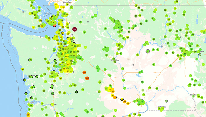
So we elected to share our monitor’s data, which happens automatically through the internet once you enable it. PurpleAir then maps all that real-time data, which looks like:
In addition, that PurpleAir data is used by sites like airnow.gov and weatherunderground.com.
Not only do we feel great about contributing to the community by plugging a large gap in the available data — our monitor is the only one in almost 2,000 square miles! — but it helps us make personal decisions, such as whether to work outside that day or wear an N95 mask while going for groceries.
I imagine it could also be useful as a kind of remote wildfire early-detection alarm. If I’m away from home, but I can see that my monitor suddenly spikes to really polluted air, that could be a good early sign for me or my neighbors that a fire has started nearby!
My family is glad we invested the $250 and turned on data sharing, so you should check it out!
You are reporting the comment """ by on