Excited to finally share that we’ve rebuilt TP from scratch, and I wanted to share a preview and some of our thinking. You won’t need to do anything.
Edit: Originally thought we’d launch Dec 1, but the person building the website got sick with the ‘tripledemic’, so it’ll be January at earliest.
Context: I started TP as a weekend side project, thinking it would only ever be me blogging my thoughts at small scale. That’s why I launched it on WordPress, which is a great off-the-shelf tool for common, simple blogs.
But, as TP grew into something much more and we experimented with new features, we really started to be hamstrung by WordPress and it’s caused a huge amount of problems/distractions the last two years — especially since we have very limited resources to deal with it.
With your help, we’ve also learned a lot about what TP should be (and should not be.) After all, there’s never been a preparedness site/community even close to this before, so there was a lot to figure out about how to organize info, whether we could afford to pay people to work on this stuff, how the forum fits in, did people want thin vs deep content, etc.
So while the site has all new behind-the-scenes code and a new design, most of it will feel familiar to you. Here’s some of the biggest changes:
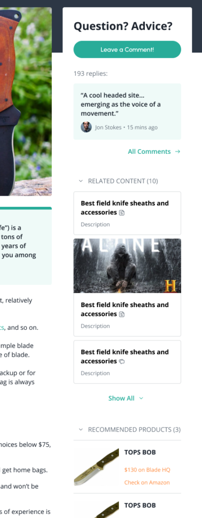
Articles now have floating sidebars that summarize the comments, recommended products, and related content:
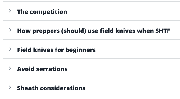
Knowledge base articles, which are often quite long, will load into mobile-friendly collapsed sections that you can expand/contract. Similar to viewing Wikipedia on mobile:
The blog and forum are merging into one, with the ‘blog’ going away. Each of those areas started on their own for different reasons, but we realized over time they were essentially the same thing. That’s why the only thing on the blog recently has been the News Roundups.
The new site is better organized around two major areas: the evergreen articles / knowledge base our core team edits, such as the “Best ___” product roundups or the IFAK checklist, and the open forum where anyone can publish.
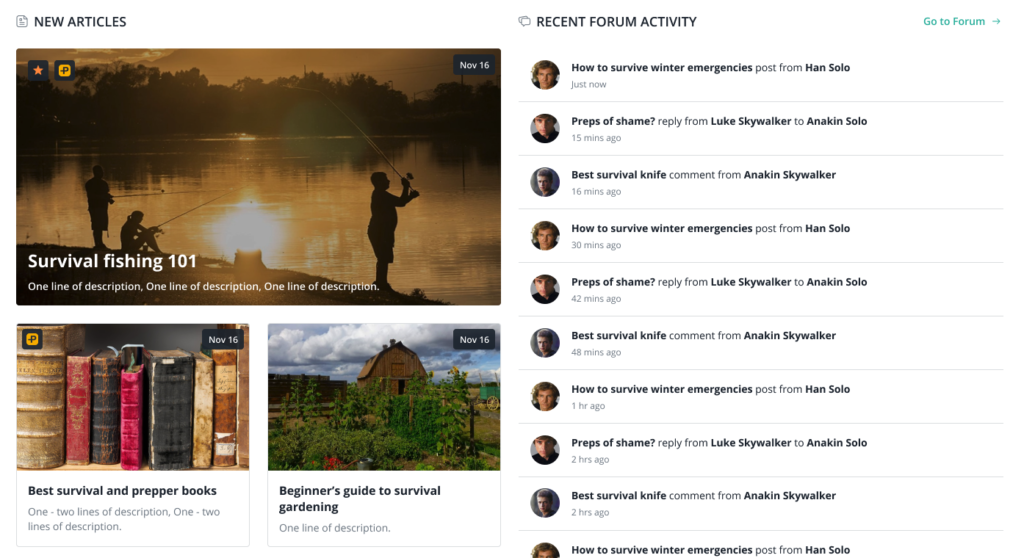
The forum will be less hidden, with equal weight on the homepage:
Your contributions in the forum/comments directly improve the core knowledge base. I can’t personally keep up with reviewing all the new products, for example, to keep the main articles updated. But you can!
So when you in the community contribute your thoughts, like these recent reviews of lanterns or a new book, that forum thread is not only valuable in itself but it also becomes part of the sausage making for the Best Lanterns or Best Books articles.
Perhaps you’ve noticed that, already on this old site, some forum threads had “Related Articles” in the sidebar. That’s because a moderator thought “this is a great convo, let’s associate it with XYZ article!” So then if you’re looking at the Best Books article, you can see all the various convos that went into the sausage making. And vice versa. Just want a simple answer? Boom, go to the main article. Want to see the nuances and thinking behind what’s on the main article? Dig into the supporting convos.
You’ll get credit, too, with special awards on your new profile pages and credit as a contributing author on the article(s) your work gets associated with. For example, where it shows the authors faces under an article title, you’ll be able to expand to see just who contributed and what their credibility is.
I think of this concept as a hub-and-spoke model: We know we want a single page somewhere for a given topic (eg. best knife), which is a hub. All of the various user-generated discussions around that topic are the spokes. Each piece has value, but together they are 1+1=3.
This will also help us scale while maintaining high quality for the articles / knowledge base. It’s the same reason why Wikipedia evolved over time to have a core team of editors that curate the bottoms-up contributions from the public.
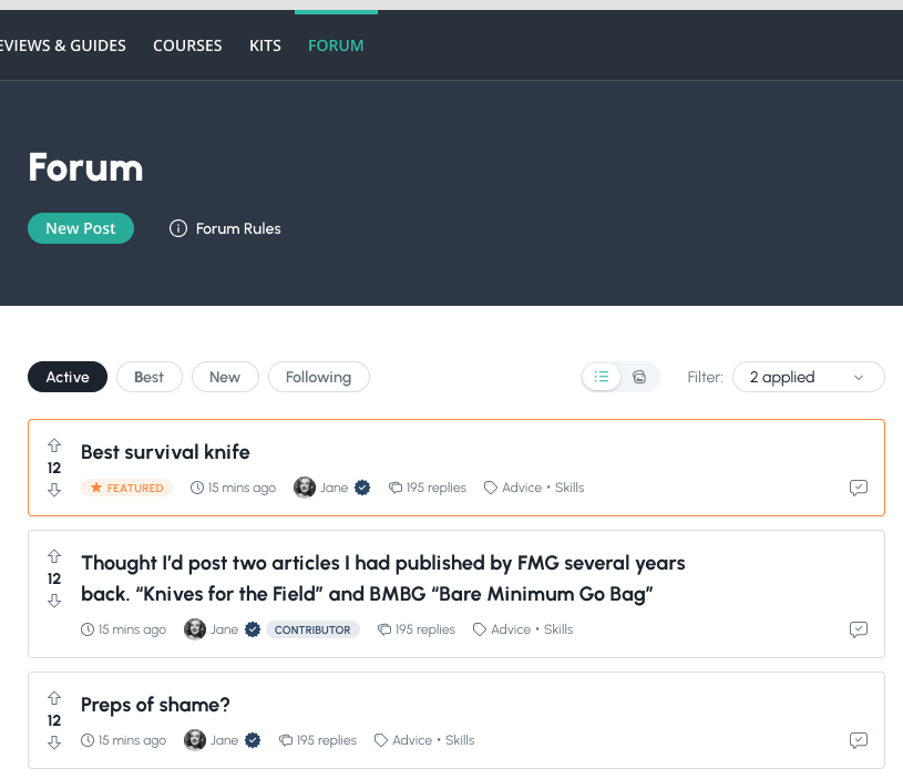
Cleaner forum:
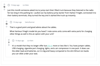
It’s easier to visually understand threaded conversations / who’s replying to who, with up to three ‘layers’ of replies:
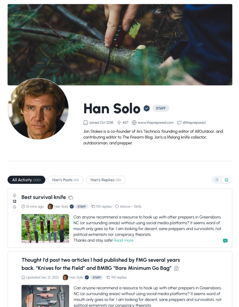
New profiles:
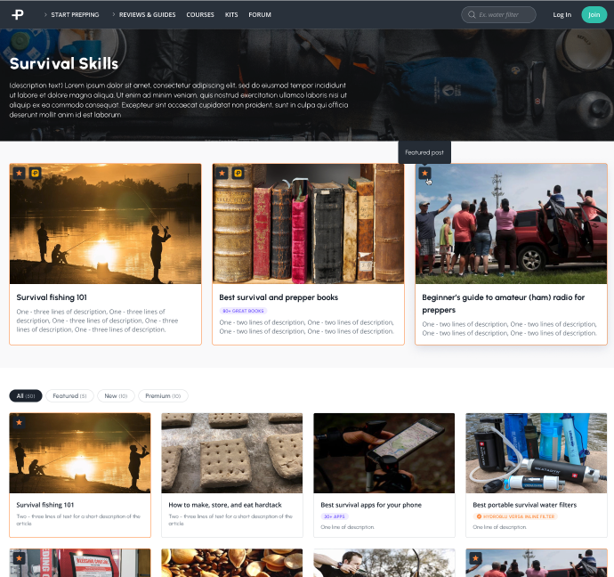
Cleaner article organization:



You are reporting the comment """ by on